This page was intentionally left blank
Coding Replications
For coding replications, whenever applicable, please follow this page or hover on the specific slides with containing coding chunks.
.qmd
format, containing a thorough discussion for all examples that have been showcased. This file, that will be posted on eClass®, can be downloaded and replicated on your side. To do that, download the file, open it up in RStudio, and render the Quarto document using the Render button (shortcut: Ctrl+Shift+K
).Introducing: the Grammar of Graphics
The Grammar of Graphics sets up the foundations that underlie the production of all types of charts, ranging from pie charts, bar charts, scatterplots, and many more. To that matter, the Grammar of Graphics presents a unique foundation for producing charts from quantitative information that are widely used in scientific journals, newspapers, statistical packages, and data visualization systems.
R
: I introduce you to the wonderful world of ggplot2
ggplot2
ggplot2
is a system for declaratively creating graphics, based on The Grammar of Graphicsggplot()
, supplying the data
and a aesthetic mapping (aes
), like x
and y
axis, groupings, etcgeom
), the shape of the visual elements contained in the visualizationlayers
on top on the geometry (titles, annotations, etc) and customize your theme (font size, background color, etc)Key Highlights
ggplot2
has a rich ecosystem of extensions - ranging from annotations and interactive visualizations to specialized genomics - click here a community maintained listggplot2
foundationsWe will illustrate the use of ggplot2
to replicate the Grammar of Graphics foundations using the FANG
dataset, which is loaded together with your slides - if you prefer to do it direclty in R
, hit the download button and load it using read_delim('FANG.txt')
To get ggplot2
in your session, either load tidyverse
altogether of directly load the library:
ggplot2
for data visualizationsWe will be using the FANG
dataset, which contains basic stock information from popular U.S. techonology firms: Facebook (Meta), Amazon, Netflix, and Google (Alphabet)
The first step in using ggplot2
is to call your data
dataframe and supply the aesthetic mapping, which we’ll refer to as aes
data
argument refers to the dataset usedaes
argument contains all the aesthetic mappings that will be usedggplot2
what the raw information to be used and where it should be mapped!META
dataset and call ggplot
, mapping the date
variable in the x
axis, adjusted
variable in the y
axis, and symbol
in the group
aesthetic. The FANG
dataset and ggplot2
have been already loaded for you. Even if you submit the wrong answer, a live-tutoring feature will provide you with a handful of tips to adjust your code and resubmit your solution.
Use the ggplot()
function together with aes(x, y, group)
:
#Let's use Apple (META) adjusted prices
META=FANG%>%filter(symbol=='META')
#Use ggplot2 to map the aesthetics to the plot
ggplot(META, aes(x=date,y=adjusted,group=symbol))
geom
You probably thought you did something wrong when you saw an empty chart with the named axis, right? However, I can assure: you did great!
It is all about the philosophy embedded in the Grammar of Graphics: you first provide the data
and the aes
(thetic) mapping to your data
Now, ggplot
knows exactly which information to select and where to place it. However, it is still agnostic about how to display it
We will now add a geometry layer - in short, a geom
:
ggplot
object addition symbol (+
)geom_point()
, geom_col()
, geom_line()
- access here for a complete listgeom
, practiceggplot
object, try out the following geoms: geom_point()
, geom_col()
, and geom_line()
. Which one do you think is the best for the task? The FANG
dataset and ggplot2
have been already loaded for you. Even if you submit the wrong answer, a live-tutoring feature will provide you with a handful of tips to adjust your code and resubmit your solution.
In general, using geom_line()
suits the best for time series
#Let's use Meta (META) adjusted prices
META=FANG%>%filter(symbol=='META')
#Use ggplot2 to map the aesthetics to the plot
ggplot(META, aes(x=date,y=adjusted,group=symbol)) +
geom_line()
Your main chart is now all set:
data
and the necessary aes
(thetic) mappings to the chart;geom
(metry), that was selected to display the dataThe philosophy behind the Grammar of Graphics is now to add layers of information on top of the base chart using the +
operator, like before
We will proceed by including several layers of information that will either add or modify the behavior of the chart, making it more appealing to our audience:
geom_smooth()
annotation
and labs
scale_y
and scale_x
Try to sequentially add these layers and re-run the code to see how it reflects on the output!
ggplot
object, add a smoothed trend of adjusted prices using the geom_smooth(method='loess')
geometry and adjust the labels of your axis, chart title, and subtitle. You can pass additional layers using the +
operator. For changing the labels, you can use the labs(x='Your X Label',y='Your Y Label', title='Your Title', subtitle='Your subtitle')
syntax. The x-axis should be called “Date,” y-axis should be called “Adjusted Prices”, the title should be called “META Prices Over Time”, and the subtitle should be called “Source: Yahoo! Finance”. The FANG
dataset and ggplot2
have been already loaded for you. Even if you submit the wrong answer, a live-tutoring feature will provide you with a handful of tips to adjust your code and resubmit your solution.
You can call the geom_smooth()
along with method='loess'
to have a smoothed trend added on top of your chart, and customize your labels by calling the labs()
argument. You can chain these operations on top of your chart using the +
sign.
#Let's use Meta (META) adjusted prices
META=FANG%>%filter(symbol=='META')
#Use ggplot2 to map the aesthetics to the plot
ggplot(META, aes(x=date,y=adjusted,group=symbol)) +
geom_line()+
#Adding a trend
geom_smooth(method='loess')+
#Adding Annotations
labs(title='META adjusted prices',
subtitle = 'Source: Yahoo! Finance',
x = 'Year',
y = 'Adjusted Prices')
Apart from simply changing the labels of your axis, titles and subtitles, you can also use ggplot2
to customize the appearance of your axis:
scale_x_{}
apply a given structure to the x-axis - e.g, scale_x_date()
,scale_x_continuous()
scale_y_{}
apply a given structure to the y-axis - e.g, scale_y_continuous()
etcWith that, you can, for example:
In this way, you can impose meaningful structures in your chart depending on the type of data you are considering in your mapping to x
and y
axis!
Click here to see comprehensive list of all customizations that can be done across both x-axis and y-axis for continuous scales (scale_x_continuous()
and scale_y_continuous()
)
Click here to see comprehensive list of all customizations that can be done across both x-axis and y-axis for date scales (scale_x_date()
and scale_y_date()
)
Formatting scales
To properly format the appearance of your axis, make sure to have the scales
package properly installed and loaded. You can do so by calling install.packages('scales')
and library(scales)
.
ggplot
object, customize the appearance of the x-axis and y-axis in the following way: the x-axis shoudl be formatted as a date using an appropriate function that shows each year as a breakpoint, whereas the y-axis should be formatted in dollar terms, ranging from zero to one thousand dollars, by increments of 50, using an appropriate function. You can pass additional layers using the +
operator. The FANG
dataset and ggplot2
have been already loaded for you. Even if you submit the wrong answer, a live-tutoring feature will provide you with a handful of tips to adjust your code and resubmit your solution.
Use scale_x_date()
with the appropriate arguments to format the x-axis, doing the same thing for the y-axis using scale_y_continuous()
:
#Let's use Meta (META) adjusted prices
META=FANG%>%filter(symbol=='META')
#Use ggplot2 to map the aesthetics to the plot
ggplot(META, aes(x=date,y=adjusted,group=symbol)) +
geom_line()+
#Adding a trend
geom_smooth(method='loess')+
#Adding Annotations
labs(title='META adjusted prices',
subtitle = 'Source: Yahoo! Finance',
x = 'Year',
y = 'Adjusted Prices')+
#Changing the behavior of scales
scale_x_date(date_breaks = '1 year',labels = year) +
scale_y_continuous(labels = dollar, breaks = seq(from=0,to=1000,by=50))
Question: what if we wanted to add more data?
filter(symbol)=='META'
to select only information from Meta to your chartggplot
:
group=symbol
, ggplot
already knows that it needs to group by each different string contained in the ticker columnaes
mapping, colour=symbol
, so that ggplot
knows that each symbol
needs to have a different color!We have included all FANG stocks into the same chart. Easy peasy, lemon squeezy!
As far as we could go on adjusting the layers, it seems that the chart conveys too much information:
Although you could easily remove the trend lines, ggplot2
also comes with a variety of alternatives when it comes to charting multiple data that may come in handy:
facet_wrap
, controlling the axis as well as the number of rows and columnsfacet_wrap()
facet_grid()
tq_get()
to get live FANG prices.ggplot
to automatically update the chart;ggplot
adoption throughout the R
usiverse relates to themes
: complete configurations which control all non-data display
theme_minimal()
, theme_bw()
theme()
if you just need to tweak the display of an existing themethemes()
to your chartR
community is on your side!There are endless customizations that you could think of that could be applied to a theme
In special, the package ggthemes
provides extra themes
, geoms
, and scales
for ggplot2
that replicate the look of famous aesthetics that you have often looked and said: “how could I replicate that?”
To get access to these additional graphical resources in your R
session, install and load the package using:
ggthemes
library here
websitetheme
customizationEven with customized themes, you might still want to do your own customizations
It is easy to access each and every component of the chart by adding theme
(using the +
operator):
theme()
function to adjust some aspects of our chart, such as font size, angle, and text width, to make it look more professionaltheme()
adjustments to the charttidyquant
Like in our previous lecture, tidyquant
added very important functionalities for those who work in finance to easily manage financial time series using the well-established foundations of the tidyverse
When it comes to data visualization, tidyquant
also provides a handful of integrations that can be inserted into your ggplot
call:
geom_barchart
and geom_candlestick
geom_ma
and geom_bbands
theme_tq
, available\(\rightarrow\) For a thorough discussion, see a detailed discussion on tidyquant
’s charting capabilities here
tidyquant
, continued#Set up start and end dates
end=Sys.Date()
start=end-weeks(5)
FANG%>%
#Make sure that date is read as a Date object
mutate(date=as.Date(date))%>%
#Filter
filter(date >= start, date<=end)%>%
#Basic layer - aesthetic mapping including fill
ggplot(aes(x=date,y=close,group=symbol))+
#Charting data - you could use geom_line(), geom_col(), geom_point(), and others
geom_candlestick(aes(open = open, high = high, low = low, close = close))+
geom_ma(ma_fun = SMA, n = 5, color = "black", size = 0.25)+
#Facetting
facet_wrap(symbol~.,scales='free_y')+
#DeepSeek date
geom_vline(xintercept=as.Date('2025-01-24'),linetype='dashed')+
#Annotations
labs(title='FANG adjusted prices before/after DeepSeek announcement',
subtitle = 'Source: Yahoo! Finance',
x = 'Date',
y = 'Adjusted Prices')+
#Scales
scale_x_date(date_breaks = '3 days') +
scale_y_continuous(labels = dollar) +
#Custom 'The Economist' theme
theme_economist()+
#Adding further customizations
theme(legend.position='none',
axis.title.y = element_text(vjust=+4,face='bold'),
axis.title.x = element_text(vjust=-3,face='bold'),
plot.subtitle = element_text(size=8,vjust=-2,hjust=0,margin = margin(b=15)),
axis.text.y = element_text(size=8),
axis.text.x = element_text(angle=90,size=8))
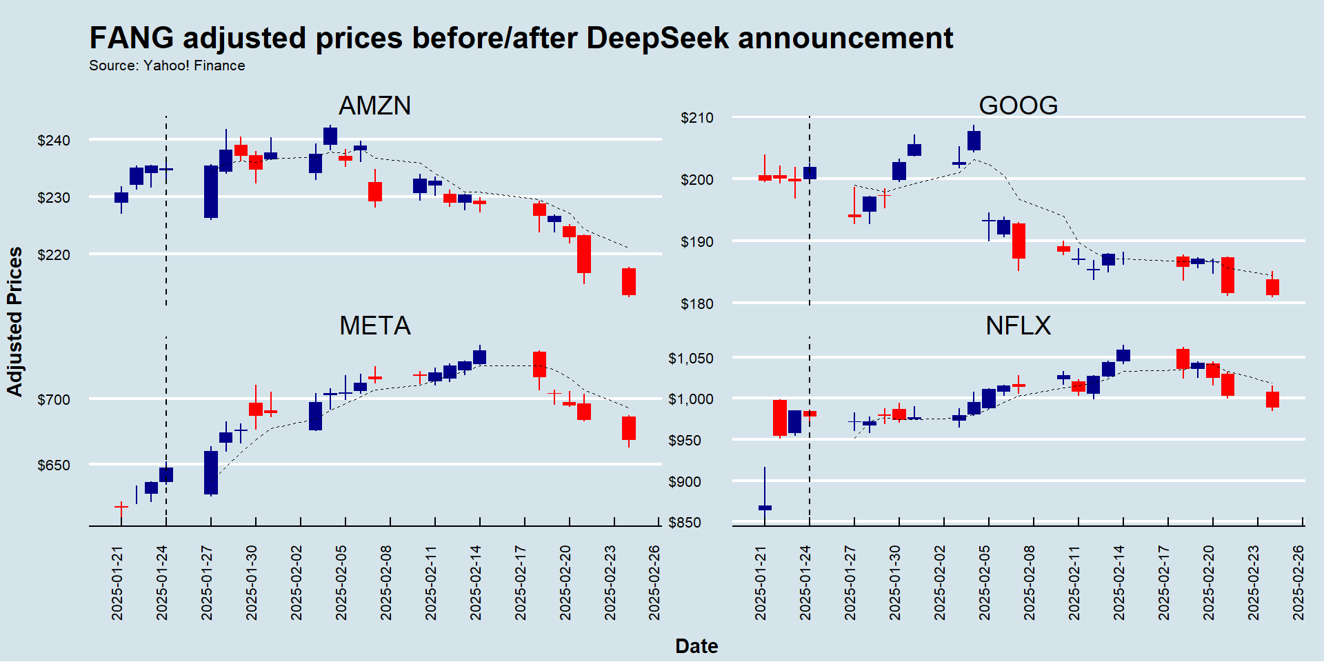
ggplot2
ggplot2
is, by and large, the richest and most widely used plotting ecosystem in the language
However, there are also other interesting options, especially when it comes to interactive data visualization
The plotly ecosystem provides interactive charts for R, Python, Julia, Java, among others - you can install the R
package using install.packages('plotly')
The Highcharts is another option whenever there is a need for interactive data visualization - you can install the R
package using install.packages('highcharter')
In special, the highcharter
package works seamlessly with time series data, especially those retrieved by the tidyquant
’s tq_get()
function
highcharter
package#Install the highcharter package (if not installed yet)
#install.packages('highcharter')
#Load the highcharter package (if not loaded yet)
library(highcharter)
#Select the Google Stock with OHLC information and transform to an xts object
GOOG=tq_get('GOOG')%>%select(-symbol)%>%as.xts()
#Initialize an empty highchart
highchart(type='stock')%>%
#Add the Google Series
hc_add_series(GOOG,name='Google')%>%
#Add title and subtitle
hc_title(text='A Dynamic Visualization of Google Stock Prices Over Time')%>%
hc_subtitle(text='Source: Yahoo! Finance')%>%
#Customize the tooltip
hc_tooltip(valueDecimals=2,valuePrefix='$')%>%
#Convert it to a 'The Economist' theme
hc_add_theme(hc_theme_economist())
Exercise
tq_get()
to load information for GameStop (ticker: GME) and store it in a data.frame
. Using the arguments from
and to
from tq_get()
, filter for observations between occurring in between December 2020 (beginning of) and March 2021 (end of)ggplot(aes(x=date,group=symbol))
, along with geom_candlestick()
and its appropriate arguments, to chart the historical OHLC pricesgeom_vline
, setting the xintercept
argument to the date of the Reddit frenzy (as.Date('2021-01-25')
)theme_economist()
. Make sure to have the ggthemes
package installed and loadedtheme()
and labs()
to adjust the aesthetics of your theme and labels as you think it would best convey your message. For example, you can use the scales
package to format the appearance of your x and y labels (for example, displaying a dollar sign in front of adjusted prices)#Libraries
library(tidyquant)
library(tidyverse)
library(ggthemes)
library(scales)
#Setting start/end dates + reddit date
start='2020-12-01'
end='2021-03-31'
reddit_date=as.Date('2021-01-25')
#Get the data
tq_get('GME',from=start,to=end)%>%
#Mapping
ggplot(aes(x=date,group=symbol))+
#Geom
geom_candlestick(aes(open = open, high = high, low = low, close = close))+
#Labels
labs(x='',
y='Adjusted Prices',
title='GameStop (ticker: GME) prices during the reddit (Wall St. Bets) frenzy',
subtitle='Source: Yahoo! Finance')+
#Annotation
geom_vline(xintercept=reddit_date,linetype='dashed')+
annotate(geom='text',x=reddit_date-5,y=75,label='Reddit Frenzy Starts',angle=90)+
#Scales
scale_x_date(date_breaks = '2 weeks') +
scale_y_continuous(labels = dollar) +
#Custom 'The Economist' theme
theme_economist()+
#Adding further customizations
theme(legend.position='none',
axis.title.y = element_text(vjust=+4,face='bold'),
axis.title.x = element_text(vjust=-3,face='bold'),
plot.title = element_text(size=10),
plot.subtitle = element_text(size=8,vjust=-2,hjust=0,margin = margin(b=15)),
axis.text.y = element_text(size=8),
axis.text.x = element_text(angle=45,size=8,vjust=0.75))
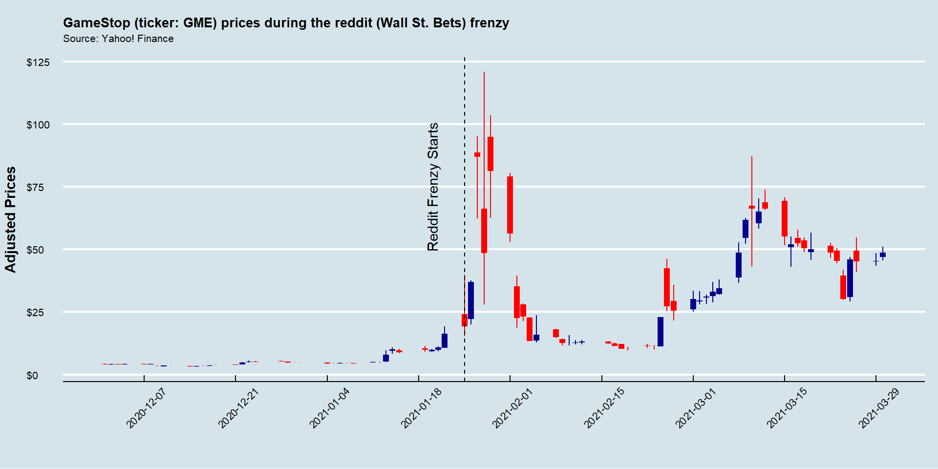